QUALITY TOOL: PARETO ANALYSIS

History
Pareto Analysis gets its name from the Italian-born economist Vilfredo Pareto (1848-1923) who observed that a relative few people held the majority of wealth.
Dr Joseph Juran was the first to point out that what Pareto had observed, was a universal principle. More specifically, that in any group of factors contributing to a common effect, a relative few account for the bulk of the effect.
Further, Dr Juran coined the terms vital few and useful many to refer to those few contributions which account for the bulk of the effect; and to those many others which account for a smaller proportion of the effect.
Examples
As experienced managers and professionals, we intuitively recognize the Pareto principle and the concepts of vital few and useful many.
For example, we might observe that:
- Our top 15 % customers account for 70 % of our revenue
- A few employees account for the majority of absenteeism
- In a meeting, few people actively participate, while a majority are quiet
- In a 20-step manufacturing process, 3 of the operations account for 50 % of the scrap generated
- Of the 10 unique services that our hospital offers, 3 of the services account for 80 % of patient complaints.
Recommendation
If the Pareto principle is so obvious and so simple, then what is all the fuss about it?
If we really understood the simple but profound Pareto principle, our first step, when faced with a flood of problems, would be to gather data and facts to identify the vital few problems. Refer Quality Capsule 014.
Thereafter, we could then focus our attention and improvement efforts on those few things that would give us the greatest improvement in quality. Refer Quality Capsule 005.
Pareto Diagram of Errors on Order Forms
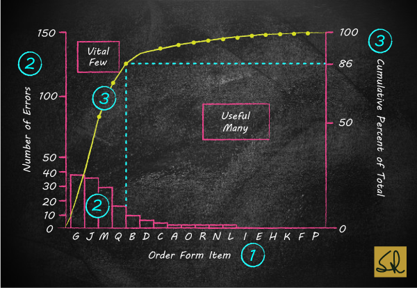
- 18 items on the order form are listed on the horizontal axis, in the order of their contribution to the total
- The height of each bar relates to the left-vertical axis, and shows the number of errors detected on that item
- The line graph corresponds to the right-vertical axis, and shows the cumulative-percent of total
- Note how the slope of the line graph begins to flatten out, after the first four contributors (the vital few) account for 86 % of the total.
Insight
Try converting the left-vertical axis to COPQ; and then observe how senior managers embrace quality improvement! Refer Quality Capsule 004.
Next
In my next edu-blog, on Wednesday 21 October, I will introduce Histograms, for univariate analysis.
Even as a stand-alone tool, a Histogram can lead to breakthroughs in purchasing departments, as well as key customer facing processes in hotels, hospitals, airports, etc.
Histograms also highlight COPQ.
Thanks for highlighting Pareto tool.
The principle can be applied to all aspects of management to priortize areas of focus.
One good learning is that Pareto tool needs to show impact than errors alone. The impact of a particupar error on customer satisfaction may be much higher and its contribution to total may be much lower.
Absolutely, Sachin
Fantastic description …Very much impressed with your way of detailing …n explaining the terms in easily understandable manner… especially for the students…I will take every opportunity to disseminate what I was updated with Quality Management…
Thank you Dr Jaikumar for your positive feedback