QUALITY TOOL: SCATTER DIAGRAMS

Understanding Relationships
Identifying the true cause of a problem is the key to effective quality improvement.
When we use Scatter Diagrams for the diagnosis of a problem, we are basically looking for a relationship between two measurable variables. We hope to discover an insight into the true cause of a problem.
Unfortunately, the true cause of a problem is usually not obvious. Therefore we must proceed very cautiously.
Analysing Scatter Diagrams
Analysing scatter diagrams is a four-step process:
- Develop a plausible and relevant theory about the suspected relationship between two variables of concern.
- Collect appropriate paired data (Quality Capsule # 014) and construct a scatter diagram.
- Identify and classify the pattern of correlation.
- Question your original theory and consider other explanations for the observed pattern of correlation.
Potential Pitfalls and Problems in Interpretation
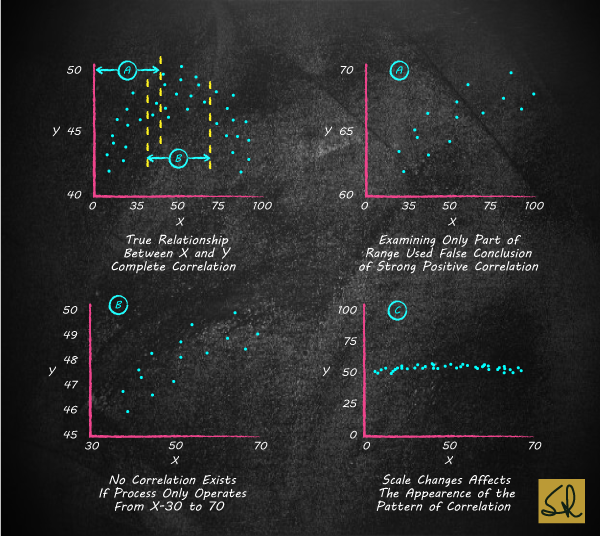
Range of Data
It is critically important that a team restrict its interpretation of the scatter diagram to the range of the observations. The actual relationship between two variables X and Y is shown in the top left diagram.
But suppose the team had gathered data on X for the range 0 to 40, their scatter diagram would resemble the top right diagram labelled ‘A’. On the basis of a strong positive correlation displayed in the diagram, the team would be tempted to assume that a large value of X, say X = 80, would yield a correspondingly large value of Y. Obviously, this conclusion about the relationship between X and Y, which goes outside the range of the data shown in ‘A’, would be incorrect.
Range of Operations
Suppose the process operates within the range X = 30 to 70. The scatter diagram in this region of actual operations is shown in the bottom left diagram labelled ‘B’.
In the region of actual operation there is no correlation. Control of one variable will not help us control the other.
Effect of Scale
The diagram at the bottom right labelled ‘C’ shows the same data, but here the team has decided to make the X and Y axes the same.
This simple change of scale makes it appear that the value of Y is almost constant, regardless of X.
Correlation without Physical Understanding
Scatter diagrams only show relationships. They do not prove cause and effect (Quality Capsule #012).
One must have plausible, physical explanation to establish cause and effect.
Next
In my next edu-blog, on Wednesday 4 November, I will share an appropriate Quality Fable: Indian Curry and British Satisfaction. This fable will stimulate your thinking on application of Quality Tools.